CSS Grid is great, by this point in time everyone on the internet has covered that at length. Grid is a powerful front end layout tool, and the more time I spend using it the more it reminds me of the lessons I learned in my college typography class, and of my time as a print designer using Adobe InDesign.
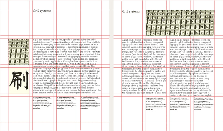
The Swiss Design style has been a huge influence on layout design over the past 100 years, and the main lessons we learned in college were around the modular grid. To quote thinkingwithtype.com —
A modular grid has consistent horizontal divisions from top to bottom in addition to vertical divisions from left to right. These modules govern the placement and cropping of pictures as well as text.
This same logic most likely had a large impact on the formation of the css grid spec. The ability to define row and column gaps, as well as set repeating template areas using rem and em units to make them relational to the base font size is a perfect tool for adapting this classic design principle to the flexibility of an internet browser.
Having the ability to specifically define how content and images span both rows and columns brings browsers even closer to print layout tools like Adobe InDesign, which of course was designed around the ability to set up traditional design grids.
Configuring Grids in Different Environments

Swiss Modular Grid
- four column modular grid
- baseline scaled to 10/12 font size

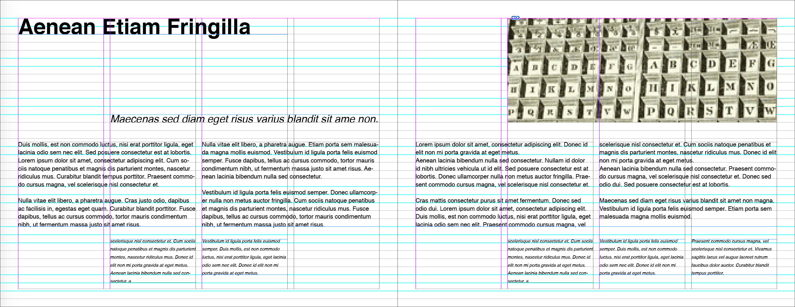
Adobe InDesign Grid
- font-size 12pt
- leading 16pt
- baseline grid 16pt increment
- 4 column grid, 12pt gutter
- 36pt margins

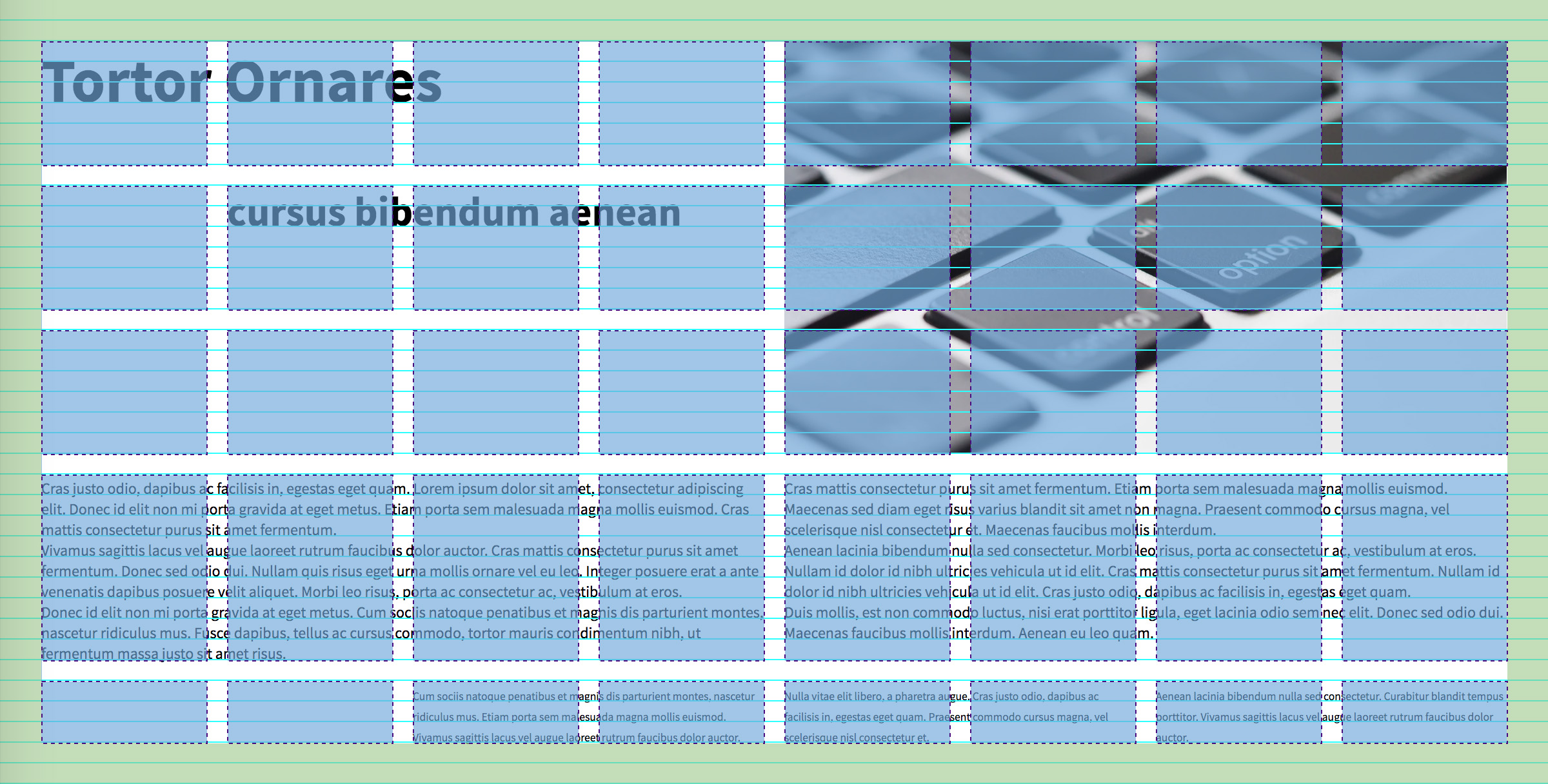
CSS Grid Layout
- font-size: 12px; (.75rem)
- line-height: 16px; (1rem)
- grid-gap: 1rem;
- columns: 6rem; except when it's not
- rows: 6 x auto;
A modular grid is created by combining a baseline grid (vertical lines running horizontally along the bottom of each letter, defined by the leading or line-height of the text), with page divisions that make a number of columns with gutters between them. The width of the gutters is often the same space between each baseline grid line.
The power that CSS Grid has over traditional print is firstly fluidity. The browser viewport can be divided into equal columns with gutters between them, and these columns will automatically adjust to a percentage of the browser width as it changes. Since font size probably isn't changing until set breakpoints, the columns can even be resized dynamically with the gutters between them staying relative to overall font size.
body {
  font-size: 12px;
}

.grid {
  padding: 1rem;
  grid-template-columns: 1fr 1rem 1fr 1rem 1fr 1rem 1fr;
}
This will create four fluid columns with a 12px gutter between them.
The second advantage css grid has over print is the ability to drastically change up a layout using media queries. Responsive designs aren't possible in print due to the nature of physical media, but print designers have always had to design for different layouts – spreads, single pages, and even sometimes half to a quarter pages for advertisements. A similar thought process can be applied to responsive design. For instance, the body font size could scale down at breakpoints and the number of defined columns decreased as things start to get too narrow. There's also a usecase for minmax() here to make this a little more automated, but on all of my projects I've still been manually configuring layouts like this.
In print, the physical size of the page determines a lot about how the grid is constructed. The baseline grid is calculated by taking into account the physical height of the page, the size of the top and bottom margins, and how many lines of text will be vertically distributed in the space. Since the height of a webpage is scalable to the amount of content this calculation works differently, but the construction of the overall grid is still highly tied to font size and line-height of the smallest text on the page.
A Quick Aside About Line-height
Line height does not work the same way on the web as it does in print. Rather than keeping the baseline the same and adding space above the characters, the css line-height property actually adds space to the top and bottom of the letters. This article is a super in depth look into exactly how this works.
Because of this, even though the math seems like a 1rem repeating vertical grid would line up with the baselines of the text, it actually ends up nearly in the middle of the vertical space between each line of text.
It seems like it would make sense to compensate for this using some math.
text {
  position: relative;
  top: (line-height - font-size) / 2;
}
This would take the total height of a line of text, remove the size of the text leaving only the empty space, then divide it in half to account for only the space added to the top. However, because different web fonts come with different negative space baked into them, this still isn't a catch all formula for applying a baseline grid to web text. Starting with the formula and then using some trial and error from there, I was able to get the heading, subheading and body text to eventually line up to the baseline grid.
The downside to this is that if for any reason you need to set the text elements to anything other than position: relative you either are introducing even more complicated css styles, or need to introduce more markup to act as wrappers. There are, of course, libraries available to help do some of the work without as much effort, but the larger question is probably "is all of this worth it just to vertically align text?"
Complications vs Benefits?
Current browser support aside, I think grid will only become more ubiquitous over the next few years. If you're taking a mobile-first layout approach, starting with everything in one central column at small sizes (and as a fallback for unsupported large browsers) and using grid to make the layout more interesting as the screen gets wider is definitely going to be the way to go. As for whether or not the extra overhead to set up a baseline grid for all text on the site is worth it, I would have to say "probably not."
I have more of a design background than a lot of developers I've worked with, and while utilization of a baseline grid might be something I noticed a designer had set up in a comp it isn't necessarily something I would go out of my way to codify in development. Most developers I know who are doing any kind of creative front end work use rem-based vertical spacing, or even better some kind of $vertical-rhythm variable to keep consistent space between their elements on the page. To me, this is enough to achieve visual consistency and hierarchy, and definitely enough to present a clean and consistent experience to your users.
A horizontal grid, or atleast the use of columns, typically does make sense for most applications. This is really easy to do if the design has been built using a design system, or a framework like Bootstrap or Foundation that come with preset column classes. I don't personally use tools like this, but I do use a lot of vw sized elements so I can always keep element widths relational by using fractions of the screen width.
However, there are certain areas where I think this kind of attention to detail can make sense. If you have a banner component, or a complex article page, and want different types of text and images all placed next to each other, I think this is about the extent to which an average visitor to the website would notice baseline alignment.
Of course, another huge variable here is working with clients and having editable, variable lengths of text on the site since that introduces a lot of unknowns into the equation. I think the best scenario in this case is having the content maintained by someone who is both design and code savvy, as they'll know what looks good and also a little of what's going on with the CSS to achieve the design.

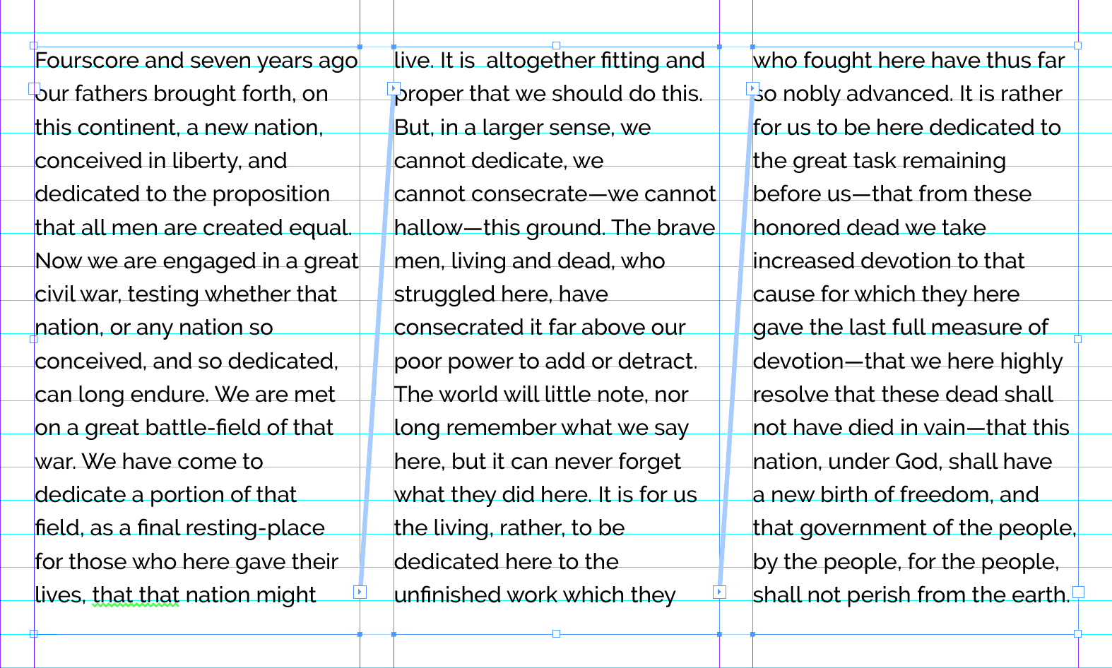
Another huge drawback to complex grid layouts is that text flow in browsers works quite differently than in tools like InDesign. Using print layout tools, text boxes can be "threaded" so that when copy overflows one box it will automatically flow into linked text boxes. There's no existing HTML / CSS / Javascript / whatever tool that treats text this way, except maybe css column-count: #; and event that isn't ideal because a user would end up scrolling to the bottom of the page and then back to the top to read additional columns.
There's some nth-child() logic that could target every odd and even <p> but with paragraphs of different lengths this might not look great. Again, this might take someone with some knowledge of both design and development to achieve the desired effect. Until browsers get a tool to handle dynamic text overflow, it seems like complex layouts are best handled somewhat manually.